- HOME
- Work culture
- Diagramming 101: How teams use diagrams to think, plan, and collaborate
Diagramming 101: How teams use diagrams to think, plan, and collaborate
- Last Updated : March 10, 2026
- 115 Views
- 12 Min Read

TL;DR
- What is diagramming? Diagramming is a visual method for representing processes, systems, relationships, and decisions.
- Why use it? It improves clarity, reduces cognitive load, and speeds up alignment.
- Where is it used? It's used in brainstorming, workflow planning, system explanation, strategy mapping, and root cause analysis.
- Common diagram types: Common types include flowcharts, mind maps, affinity diagrams, fishbone diagrams, swimlanes, ER diagrams, architecture diagrams, and journey maps.
- How to start: Pick one recurring meeting or workflow, create a simple diagram, refine it, and keep it updated.
Teams can have smart people, good tools, and plenty of meetings and still end up with the same questions repeating every week, misalignment on the full picture, and plans collapsing during execution.
Diagramming is one of the simplest ways to fix that because it turns thinking into something everyone can see, react to, and improve.
If you've ever said, “Wait, what exactly are we doing first?” or “Can someone explain this in a simpler way?” you have already felt the need for a diagram, even if you didn't call it diagramming.

What diagramming really is
A diagram is a visual way to show relationships. It can show relationships between a process and its steps, a system and its parts, a problem and its causes, and more.
But diagramming isn’t just drawing shapes. The core purpose of diagramming is to make complex thinking visible and shared.
When you diagram something, you do three things at once: you externalize your thinking so everyone can react to the same idea, you give structure to complexity so steps and dependencies become visible, and you create shared understanding so disagreements are easier to resolve.
Teams don’t disagree because they're unreasonable; they disagree because they're imagining different versions of the same thing. Diagramming makes those versions visible.
How diagramming helps teams work better
In business settings, diagramming is commonly used for workflow mapping, system architecture, strategy planning, customer journey mapping, and root cause analysis.
It reduces cognitive load
When a discussion is purely verbal or text heavy, your brain has to hold a lot of information at once, like who said what, how it connects, and what depends on what. Diagrams offload that mental effort.
Instead of remembering the whole structure, people can see it. That frees mental space for better questions and better decisions.
It speeds up alignment
Teams often meet more because they haven’t created a shared blueprint. Diagramming helps meetings produce something that can live beyond the meeting.
One solid diagram can prevent five repeated explanations later.
Example: Imagine a product team discussing how to simplify onboarding. It sounds like one goal, but people often mean very different things by it.
When they bring in a diagram, it forces clarity. The team can now discuss specific questions: Where exactly do users come in? What path should they take? Which steps matter most? Where does friction appear?
Now the whole team aligns on the same map, not just the same phrase.
It reveals gaps and assumptions
Text can hide missing steps, and slides can skip messy details. A diagram is honest because it has to show connections.
When you draw a workflow diagram, you notice a step with no clear owner, dependencies that weren’t discussed, and edge cases that can break the flow.
That visual structure makes the gaps and fragile handoffs visible.
It improves cross-functional communication
Different roles think differently. Some think best in steps. Some think in systems. Some think in stories. Diagramming gives a common language that works across those styles.
It becomes reusable documentation
A good diagram should be reusable. It can function like a shared map for the team that's referenced during incidents or used as an onboarding asset for new teammates.
This matters because teams don’t fail due to one bad decision; they fail due to repeating the same confusion every month.
Diagramming in everyday work
A diagram isn’t something you do only for presentations. The biggest value comes when you use it as part of the work, not after the work.
Here are some common places diagramming is used in everyday tasks.
Brainstorming and idea shaping
Brainstorming often produces a pile of disconnected thoughts. Diagramming helps you organize these ideas and uncover new relationships between them.
This is where techniques like affinity mapping and mind mapping shine, but even simple grouping and arrows make a big difference.
Planning workflows and processes that have handoffs
Any time work moves from one person to another, a workflow exists, even if it isn’t written down.
This makes it easier to figure out the sequence, decision points, inputs and outputs, owners for each step, and where the flow can break, so even when a new person starts working, they are well informed.
This is useful for onboarding flows, marketing execution, support escalation, QA and release processes, and internal approvals.
Explaining systems and architecture
When you’re trying to explain something complex to mixed audiences, even a simplified system diagram helps create shared understanding. Stakeholders can see what depends on what and discuss risks and bottlenecks more clearly.
Problem solving and root cause analysis
When something goes wrong, teams often jump to solutions quickly. Diagramming slows you down in the right way.
A root cause diagram, for example, can separate symptoms from causes and make contributors visible. This leads to better fixes, not just faster fixes.
Strategy and decision-making
Diagrams help you make concrete strategies and quick decisions. Some of the common places where diagramming helps with strategies are:
Mapping customer journeys
Positioning landscapes
Trade-off frameworks
Decision trees
Impact vs. effort prioritization
Even a simple two-by-two matrix can unblock a week of circular discussion.
What are the most common types of diagrams teams use?
There are dozens of diagram types, but most teams repeatedly use a small set. Each one exists for a different reason. The key isn't to memorize all of them but to understand what problem each one solves.
Flowcharts
A flowchart is a diagram that visually represents a sequence of steps in a process. It typically uses shapes to show actions, decisions, inputs, and outputs, connected by arrows that indicate direction and flow.
Flowcharts are especially useful when a process includes branching logic, such as “if this happens, go here; if not, go there.” Because they show sequences clearly, they're widely used in operations, product workflows, approvals, onboarding flows, and troubleshooting processes.
If your goal is to clarify what happens first, what happens next, and where decisions change the path, a flowchart is usually the right starting point.

Mind maps
A mind map is a diagram that organizes ideas around a central topic. Instead of following a strict linear sequence, it branches outward, showing related thoughts, subtopics, and connections.
Mind maps are often used in early-stage thinking, where structure is still forming. They're helpful for brainstorming, content planning, strategy exploration, and unpacking a complex theme into manageable parts.
Because mind maps don’t force a rigid order, they allow teams to explore freely while still maintaining visual organization.
Teams sometimes confuse mind maps and flowcharts. The difference is simple: flowcharts are designed for structured, step-by-step logic, while mind maps are better suited for exploratory, non-linear thinking.

Affinity diagrams
An affinity diagram is used to group ideas into meaningful categories based on natural relationships. Instead of starting with predefined labels, themes usually emerge from the inputs themselves.
Teams often use affinity diagrams after collecting research findings, brainstorming ideas, or gathering feedback. The process of grouping items reveals patterns that may not be obvious when looking at isolated notes.
This type of diagram is particularly useful when you have a large volume of inputs and need to move from scattered information to structured insight.

Fishbone diagrams
A fishbone diagram, also known as an Ishikawa diagram or cause-and-effect diagram, is used to identify potential causes of a specific problem. It visually organizes contributing factors into categories, branching out from a central issue.
The structure resembles the skeleton of a fish, with the problem at the head and causes forming the bones. This layout encourages teams to think systematically rather than jumping to quick conclusions.
Fishbone diagrams are commonly used in incident reviews, quality control discussions, and root cause analysis sessions where understanding contributing factors is more important than assigning blame.

Swimlane diagrams
A swimlane diagram is a type of process diagram that separates responsibilities into horizontal or vertical lanes. Each lane represents a role, team, or system and shows who is responsible for which steps.
This format makes ownership and handoffs clear. Instead of just showing what happens, it shows who is responsible at each stage.
Swimlane diagrams are useful in cross-functional workflows where confusion often arises at the boundaries between teams. By clarifying responsibility, they reduce friction and prevent dropped tasks.
Entity relationship diagrams
An entity relationship diagram, often called an ER diagram, is used to model data structures and relationships between entities within a system. It visually represents entities (such as users, orders, or products), their attributes, and how they connect.
ER diagrams are widely used in database design and back-end system planning. They help teams understand how data is organized before implementation begins.
Even for non-technical stakeholders, a simplified ER diagram can clarify how information flows and how different parts of a system depend on each other.

Architecture diagrams
An architecture diagram provides a high-level view of how components within a system interact. It shows services, integrations, databases, external systems, and dependencies in a structured way.
Architecture diagrams are especially valuable in technical and product teams where understanding connections is critical to scalability, security, and reliability.
At a broader level, even non-technical architecture diagrams can help teams see how tools, workflows, or departments connect within a larger system.
Journey maps
A journey map is a visual representation of a user’s experience over time. It outlines the steps a customer takes when interacting with a product or service, often including their goals, thoughts, emotions, and pain points at each stage.
Journey maps help teams see the experience from the user’s perspective rather than from an internal process view. By laying out the full path, from awareness to completion, they reveal friction points, unmet needs, and the moments that matter most.
They're commonly used in product, design, marketing, and customer experience discussions where understanding user behavior is critical.
Service blueprint
A service blueprint is a diagram that expands on a journey map by adding the internal processes and systems that support the customer experience. While a journey map focuses on what the user sees and feels, a service blueprint also shows what happens behind the scenes.
It typically includes frontstage actions, backstage activities, support processes, and ownership across teams. This makes it easier to connect customer-facing steps with operational responsibilities.
Service blueprints are especially useful when teams need to align internal workflows with customer expectations, identify operational gaps, or improve service reliability.

You don’t need to master every type of diagram. Fast-moving teams gain significant value by becoming comfortable with two or three that match their daily work. Over time, as needs evolve, additional diagram types can be introduced naturally.
How to choose the right diagram
Here's a simple way to choose without overthinking.
1. Start with the question you're trying to answer
Different diagrams are good at answering different questions:
What happens first, next, and after? Use a flowchart.
What ideas exist, and how do they relate? Use a mind map.
What themes or patterns are hiding in this pile of inputs? Use an affinity diagram.
Why is this happening? Use a fishbone diagram or a causal map.
Who does what, and where do handoffs fail? Use a swimlane diagram.
How does the system connect end to end? Use a system or architecture diagram.
If you choose based on the question, you avoid making diagrams that look nice but don't help.
2. Choose the right level of detail
A diagram for leaders usually needs clarity more than detail. A diagram for execution needs enough specificity so that people can act. Many diagrams fail because they mix both. They try to be a high-level overview and an implementation blueprint at the same time.
3. Use the two-minute test
A diagram should be detailed enough to drive action but simple enough to be understood quickly.
Show the diagram to someone who understands the basics but isn’t deep in the topic. If they can't explain back what it means within two minutes, the diagram is too complex, or the structure is unclear.
What good diagramming looks like
A good diagram isn’t the one with the most shapes; it’s the one that makes the conversation better.
Here are qualities that make diagrams genuinely useful.
A clear purpose
A diagram should answer a specific question. Without that, it becomes a collection of boxes and arrows.
Clear labels beat clever visuals
If people have to guess what a box means, the diagram becomes a puzzle.
Name things clearly. Use verbs for actions (like "review request" and "approve budget"), nouns for entities (like "user," "order," and "ticket"), and questions for decision points ("Approved?").
One main flow
Even in complex diagrams, try to keep one primary flow and then branch when needed. When everything is equal priority, nothing is easy to follow. A viewer should be able to trace the main story of the diagram first, then explore branches.
Consistent visual language
If one arrow means "next step" and another arrow means "data flow," differentiate them clearly or label them. This prevents confusion.
Visible assumptions and unknowns
This is how diagrams become trustworthy. If you aren’t sure about a step, mark it. If a handoff is unclear, note it. A diagram that pretends everything is known creates false confidence. A diagram that admits unknowns invites collaboration.
Make ownership explicit when it matters
In team diagrams, ownership can be the difference between clarity and chaos. Swimlanes help, but even simple tags like "owner" and "support" can prevent future confusion.
Common mistakes that make diagrams useless
Usually, it’s not diagramming that fails—it’s the way it’s introduced.
Here are the most common mistakes and how to avoid them.
Mistake 1: Using diagramming as decoration
If the team makes all decisions verbally and draws a diagram only at the end, the diagram becomes a poster, not a thinking tool.
A better approach is to diagram early while the thoughts are still forming. You’ll notice disagreements sooner and fix them faster.
Mistake 2: Overcomplicating the first draft
The first draft should be rough. Speed matters at the start. The goal is to get structure onto the page. Start with the main steps, main components, and the main decision points. Then add detail only if it helps.
Mistake 3: Making diagrams without context
A diagram without a title, purpose, or audience becomes difficult to interpret later, especially for someone who wasn’t in the room. Context is part of the diagram.
Add a one-line purpose at the top to state what the diagram is about.
Mistake 4: Leaving diagrams to rot
If a diagram is created once and never updated, it stops being a reference and starts being clutter. The real power of diagramming comes when diagrams remain connected to ongoing work.
Mistake 5: Tool switching chaos
When teams create diagrams in one tool, discuss them in another, store them in a third, and link them in a fourth, diagrams lose their value.
People often can’t find the latest version. Comments get lost, and ownership becomes unclear.
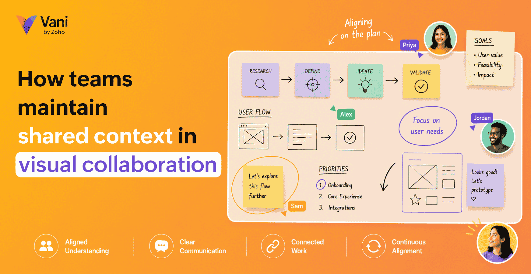
Visual collaboration tools like Vani help you keep your diagrams, comments, and calls in a single place so you can collaborate and create diagrams at the same time. Shared Kits reduce visual inconsistency, so teams spend less time fixing formatting and more time refining the actual thinking.

How to start diagramming as a team
Diagramming can be done on physical whiteboards, paper, or digital collaboration platforms, depending on how your team works.
Step 1: Pick one meeting type where diagramming will be mandatory
Choose something that repeats weekly or biweekly, such as:
Product review
Incident review
Campaign planning
Process improvement
Don't try to use diagrams everywhere in month one. Teams fail when the change is too broad.
Step 2: Decide what artifact you want at the end
This is the fastest way to keep diagramming focused.
At the end of the session, do you want a workflow map, a system overview, a root cause map, or something else?
Step 3: Start with rough, then refine
Use a two-pass approach.
Pass 1:
Get everything out. Don't worry about perfection.
Pass 2:
Clean structure, add labels, and remove duplicates.
This keeps speed and clarity.
Step 4: Build async follow-ups into the habit
Diagramming becomes valuable when it continues after the meeting. Encourage people to:
Leave comments on the diagram.
Add missing steps later.
Mark open questions.
Revisit when something changes.
This is how diagramming becomes part of how the team works, not just a meeting activity.
Step 5: Create a lightweight naming and organizing system
If your diagrams aren’t organized, they won’t be reused.
Use a simple naming system based on purpose. Store related diagrams together. When needed, add a date or version.
You can also use premade templates instead of starting from scratch. This helps teams focus on thinking instead of formatting.
What does diagramming look like in the age of AI?
AI is changing how fast teams can create first drafts, but it doesn’t remove the need for human thinking.
The practical improvements you can expect:
Faster first drafts
AI can help generate an initial structure from a prompt. That's helpful because starting from a blank space is often the biggest hurdle. You can try creating mind maps and flowcharts from prompts in Vani.
Better summaries
AI can help summarize a complex diagram into key points. That’s useful for sharing with stakeholders or onboarding new teammates.
Cleaner iteration
Teams can ask AI to suggest simplifications, highlight missing steps, or propose alternate structures, but the core responsibility stays human. Team members still need to decide what matters, validate what’s true, and align across people.
AI can help you draw faster. It can’t decide what the diagram should mean for your team.
A simple way to know if diagramming is working for your team
After a few weeks, ask three questions:
Are meetings producing clearer decisions than before?
Are fewer things being re-explained repeatedly?
Can a new teammate understand key workflows faster?
If yes, you're building real clarity.
If not, adjust some habits:
Make diagrams simpler.
Pick a better recurring use case.
Improve labeling.
Keep diagrams alive after meetings.
Diagramming is a team skill. Like any skill, it improves with repetition and feedback.
Closing thoughts and next steps
Diagramming isn't about making work look organized; it’s about making work genuinely more understandable.
If you want to start immediately, pick one workflow your team repeats and diagram it together. Keep it simple. Make it visible. Improve it over time.
When you move to a digital approach, look for a setup that supports collaboration around the diagram itself, not just drawing. The best diagramming practices happen when teams can create, comment, iterate, and keep related context close by so diagrams don’t become isolated.
If you’re exploring that style of diagramming, a visual collaboration platform like Vani can help you create diagrams alongside your other planning and execution work, so the diagram stays connected to the team, not buried in someone’s downloads folder.