- HOME
- Technology & Trends
- How to choose the right flowchart type (and why most teams get it wrong?)
How to choose the right flowchart type (and why most teams get it wrong?)
- Last Updated : June 1, 2026
- 31 Views
- 7 Min Read

Choosing the right flowchart can completely change the way an organization thinks, communicates, and scales.
Think about this for a second: three departments, twelve approvals, two software systems, and one flowchart. Somehow, the process still fails. Operations blames engineering. Engineering blames finance. Finance blames the process itself.
But the real issue was never the people.
A messy diagram creates messy thinking, an oversimplified process hides operational truth, and a poorly chosen flowchart quietly becomes the reason decisions slow down, ownership becomes blurry, and automation starts breaking.
The surprising part? Most teams never realize the problem is the flowchart itself.
Flowcharts are not just documentation artifacts anymore. They are thinking tools. They shape how teams understand systems, decisions, workflows, and responsibilities, and most organizations are unknowingly using the wrong flowchart for the wrong situation.
This article will help you understand why many systems get failed, what kind of flowcharts are available, how to choose the right one for your system, and the tools to create the flowchart. Lets get deep into it.
The problem nobody talks about
Most people already know what a flowchart is, but at its core, a flowchart is simply a business process visualization: a step-by-step sequence of actions that helps people understand how something works.
It usually starts inside a team. A company wants to build a process. Someone opens a diagramming tool like Vani and creates something simple. Everything looks clean until reality enters the room. A stakeholder requests another approval layer. An API call enters the flow. A legal review becomes mandatory. An exception case appears. Another team joins the process. Automation gets added. Async operations begin.
Suddenly, the neat little diagram turns into a spaghetti structure filled with arrows going in every direction.
Most teams think they need a bigger flowchart, but bigger flowcharts rarely solve the real problem.
The actual problem is this: the team is using the wrong visual representation for the system they are trying to explain.
That’s exactly why different kinds of flowcharts exist.
Not all flowcharts are designed for the same job
This is the important part that most teams fail to realize.
A flowchart is a universal language that bridges the gap between complex procedures and intuitive understanding. Different kinds of flowcharts are designed to answer different types of questions.
Using the wrong flowchart for your process is like using a navigation app without understanding directions. The information exists, but it doesn’t help you move clearly.
So instead of asking which flowchart looks better, ask what you're trying to understand with it.
Once teams understand that distinction, choosing the right flowchart becomes much easier. Let’s break down the different types of flowcharts and where they actually work best.
1. Process flowchart or the basic flowchart
When most people hear the word “flowchart,” this flowchart type is what they usually imagine.
A basic process flowchart contains:
Start and end points
Arrows
Diamonds or decision nodes
Boxes
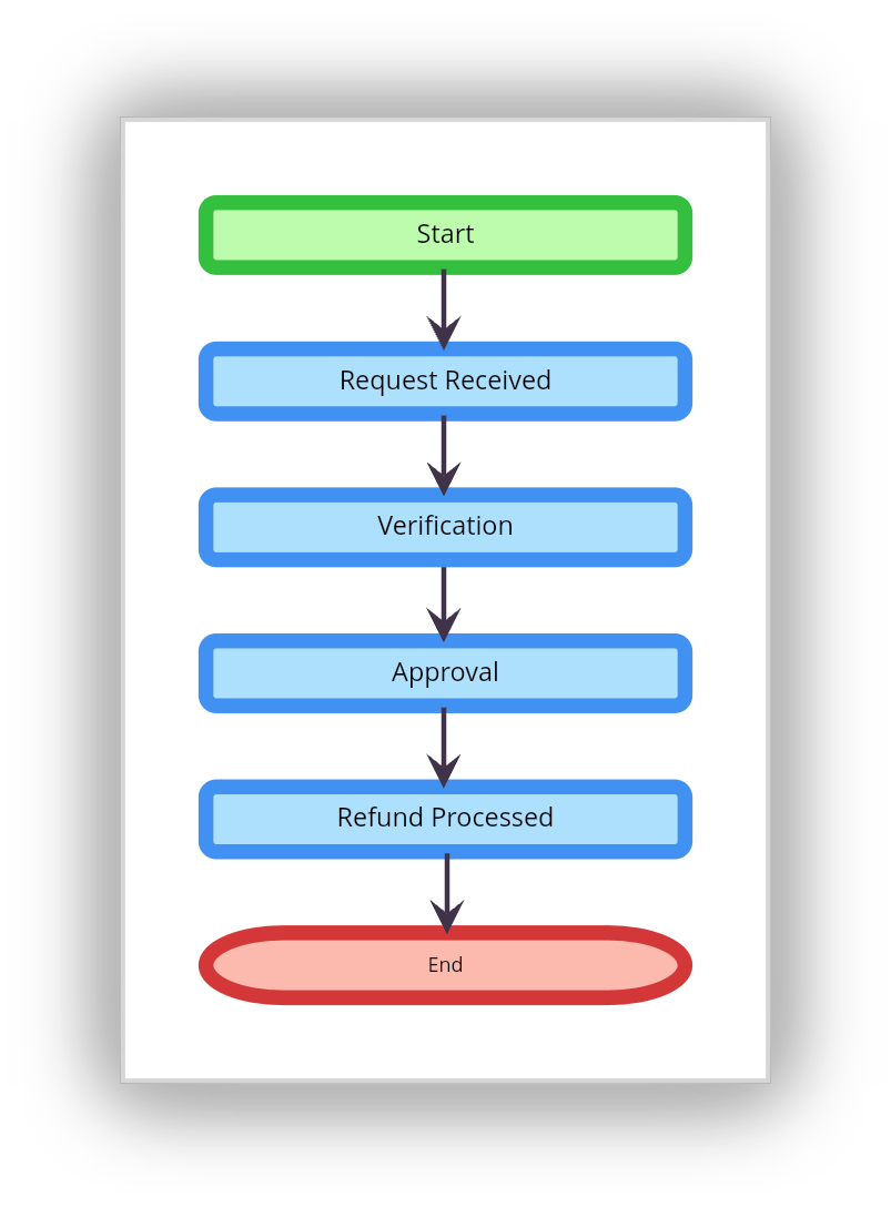
A process flowchart is a simple, familiar, and useful diagram to get started with, and the goal of this chart type is straightforward: it tells what happens next. For many situations, this flowchart type is more than enough.
Process flowchart example: Imagine a small company handling customer refunds. The process is simple:
Where process flowcharts work best
SOP documentation
Customer onboarding flows
Simple operational processes
Training materials
Where process flowcharts fail
Problems begin when multiple teams enter the system. The moment someone asks who owns a step, which department handles something, or where data goes, the basic process flowchart starts collapsing under complexity.
That’s usually the moment organizations realize they need a different flowchart.
2. Swimlane flowcharts
Most operational inefficiencies are handoff problems.
A task moves from sales to finance. Finance sends it to legal. Legal forwards it to operations. Operations waits on engineering. Somewhere in the middle, momentum disappears. This is exactly why swimlane flowcharts exist. Instead of only showing what happens, swimlane diagrams show who performs each step.
Every department, role, or team gets its own lane, making ownership instantly visible.
Using swimlane diagrams, you can immediately spot:
Approval bottlenecks
Communication overhead
Organizational silos
Dependency chains
Duplicate responsibilities
That visibility changes how teams operate.
Flowchart example: A swimlane flowchart of order fulfillment for an e-commerce website

Where swimlane flowcharts work best
Employee onboarding
eCommerce operations
Software development workflows
Manufacturing processes
Project management
Customer success operations
The reason organizations love swimlane diagrams is because they expose organizational truth.
Why do swimlane diagrams change everything?
Organizations are social systems before they become technical systems, and the swimlane diagram exposes organizational truth.
Communication overhead
Organizational silos
Approval bottlenecks
Dependency chains
This is why companies use swimlane diagrams during operational redesigns: because they reveal how the organization actually functions.
Try it: Vani's Swimlane diagram template makes it easy to assign lanes, map handoffs, and collaborate with your team in real time.
3. Decision tree flowchart
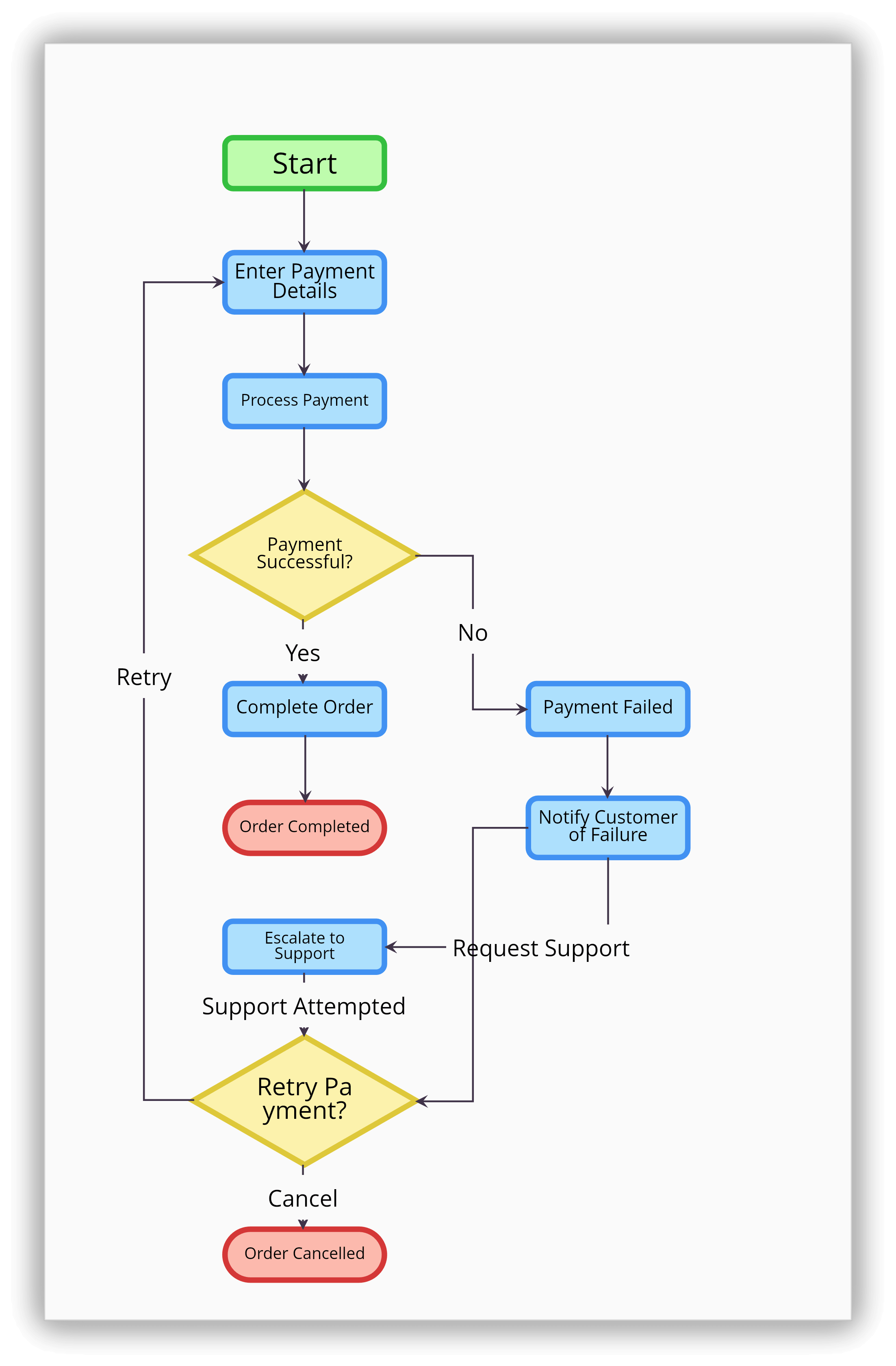
Not every workflow is sequential. Some processes depend entirely on conditions. That’s where decision flowcharts come in.
A process flowchart asks what happens next, while a decision flowchart asks what would happen if a condition became true.
That difference changes everything. These diagrams are optimized for branching logic where every path depends on a decision.
Flowchart example: Payment failed? If yes, retry transaction. If no, continue checkout.
Where does this decision tree flowchart work?
Fraud detection systems
IT troubleshooting
Customer support workflows
Medical diagnosis systems
Rule-based automation
The common mistake
Teams often overload decision flowcharts with infinite branching paths. At some point, the diagram stops helping humans think and starts resembling raw code. A good decision flowchart reduces ambiguity. It shouldn’t create more of it.
Explore Vani's decision tree template to branch out choices, evaluate, and make decisions with confidence.
4. Data flow diagram (DFD) flowchart
A data flow diagram is completely different from a traditional process flowchart. Instead of focusing on actions, DFDs focus on how information moves between systems, databases, users, and applications.
Business teams usually ask what happens next, but engineers ask where the data goes.
That distinction is what makes DFDs so powerful.
Flowchart example: A restaurant POS system
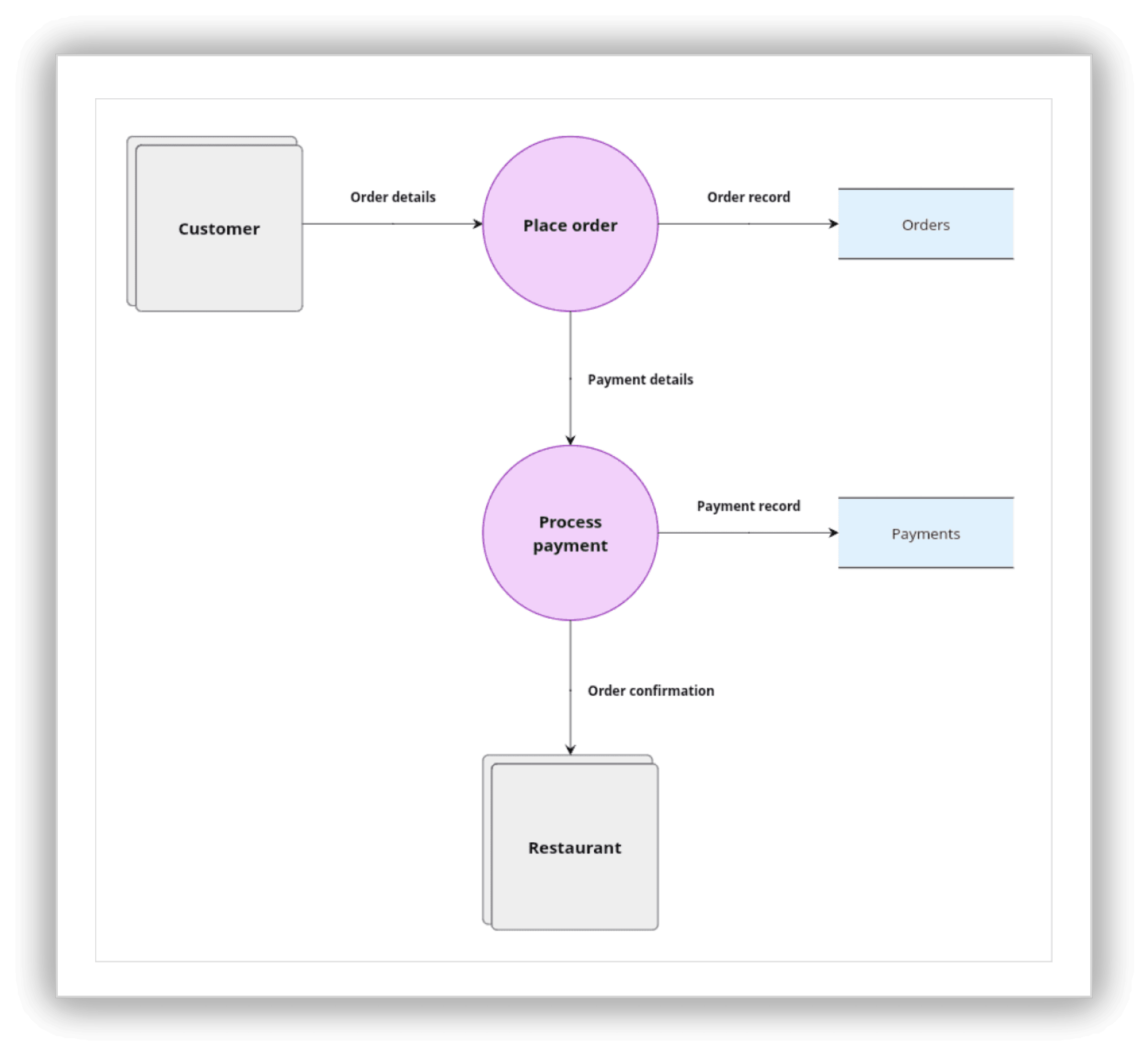
In the DFD flowchart, focus is not on operational sequence. Instead, it focuses on operation movement. A DFD visualizes:
Data flow
Data store
Process
External entities
Note: Vani comes with two types of DFD flowchart styles: Yourdon-DeMacro and Gane Sarson. Explore Vani's DFD Kit to visualize how data moves through your system.
Why DFDs matter
Modern businesses are deeply connected ecosystems with tools like ERPs, CRMs, payment gateways, analytics tools, and AI systems.
That’s why DFDs matter more than ever today in areas like:
SaaS products
API systems
Enterprise architecture
AI workflows
Distributed systems
Software infrastructure planning
Because in modern software organizations, understanding information flow is often more important than understanding process flow.
5. Workflow diagram
Workflow diagrams are designed for execution and documentation.
These diagrams became significantly more important with the rise of automation platforms, like Zoho Flow, Zapier, Make, n8n, low-code platforms, and AI agents.
Workflow diagrams help teams visualize:
Dependencies
Task progression
Automation triggers
Operational continuity
System orchestration
The diagram itself often becomes the operational workflows system.
Flowchart example: Content publishing workflow
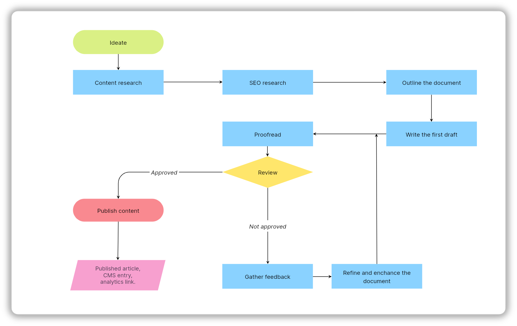
Try it: Vani's workflow diagram template make it easy to create operational workflows for your repetitive processes.
6. UML activity diagram
A UML (Unified Modeling Language) activity diagram is designed for software systems. It's a software engineering tool and helps engineers model how systems behave under complex technical conditions like:
Concurrency
State transitions
Parallel execution
Asynchronous events
Back-end logic
Unlike traditional flowcharts, UML diagrams prioritize precision over readability.
Flowchart example: UML activity diagram of a library system
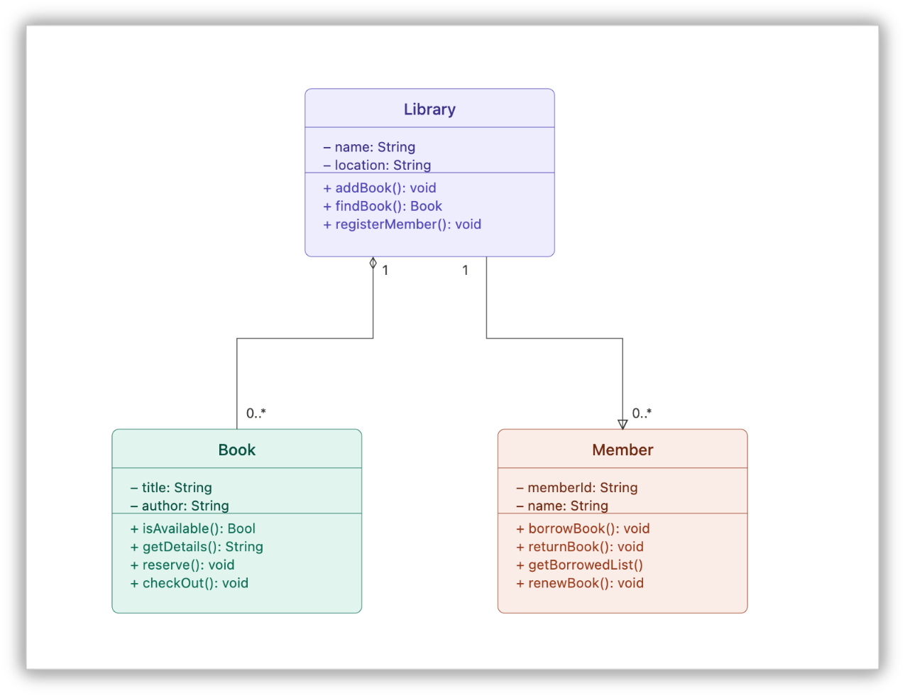
Best use cases for UML activity diagrams
System design
Software architecture
Back-end behavior modeling
Technical documentation
One of the biggest mistakes organizations make is forcing technical diagrams into business conversations. Clarity disappears the moment the diagram is optimized for the wrong audience.
7. BPMN flowcharts
Business Process Modeling and Notation (BPMN) is the enterprise version or language of process mapping.
When workflows become large, interconnected, and automation-heavy, traditional flowcharts start failing. BPMN solves that problem.
It supports:
Standardization
Governance
Parallel processes
Automation compatibility
Exception handling
Enterprise-level workflows
Flowchart example: A sales order processing workflow
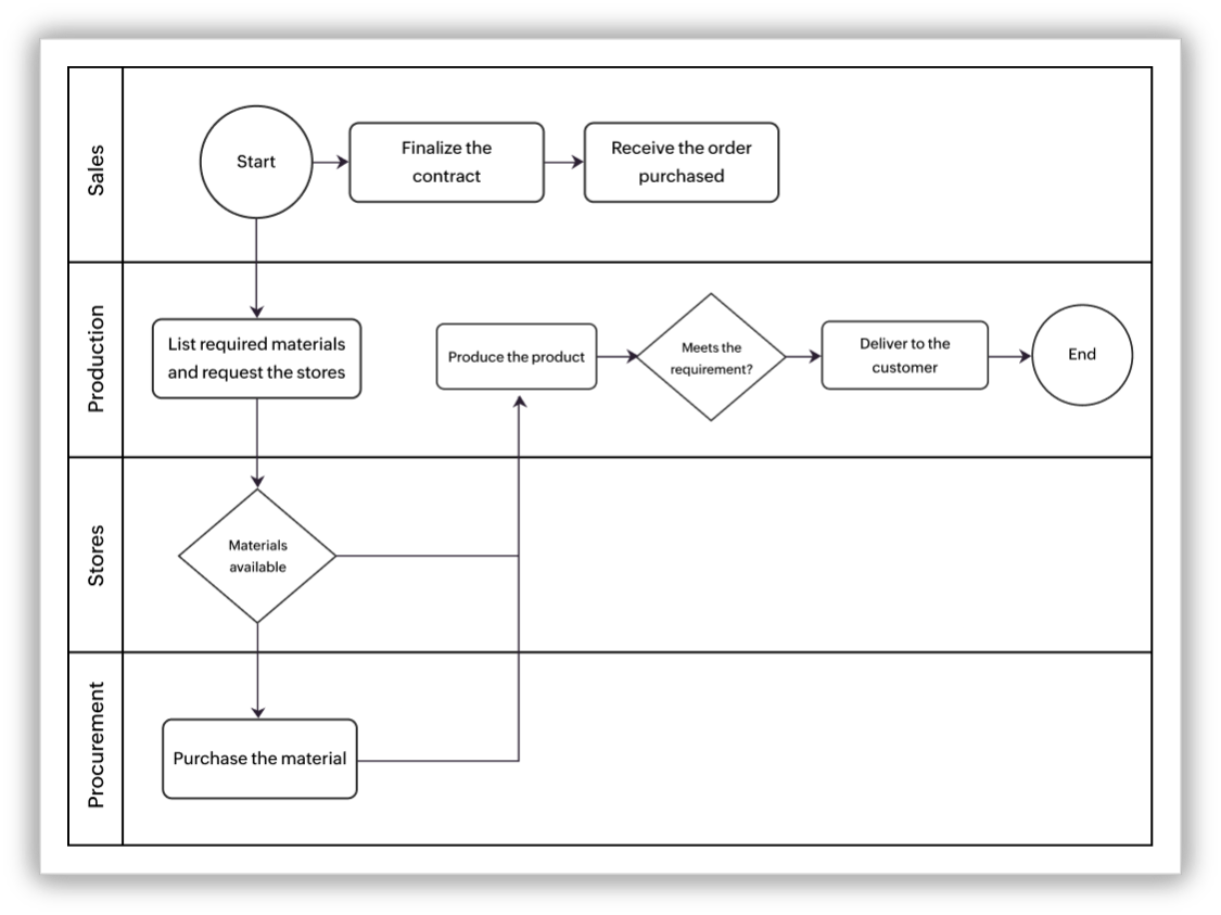
BPMN handles these large systems far better than ordinary flowcharts.
Why enterprises love BPMN
The BPMN diagram is one of the few process languages that both humans and workflow engines can interpret meaningfully, and it creates alignment between:
Business teams
Operations
Software engineers
Automation systems
Explore: Vani's BPMN Kit is built to handle enterprise-level complexity without the usual overhead.
8. Value stream maps
Value stream mapping takes flowcharts into strategic territory by focusing on where value is being lost.
That shift in thinking is powerful. The value stream mapping diagram focuses heavily on:
Delays
Wait times
Bottlenecks
Throughput
Operational waste
Flowchart example: Value stream mapping of a patient flow
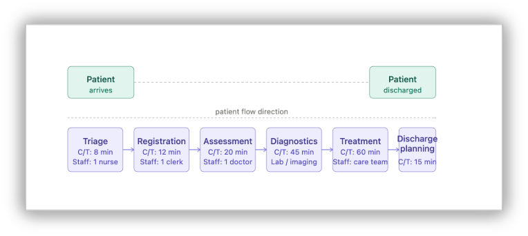
Where value stream maps work best
Manufacturing
DevOps
Logistics
Product delivery
Operations engineering
Their goal is simple: expose where organizations lose efficiency. Optimization starts with visibility.
How to choose the right flowchart
The right flowchart depends entirely on the question you are trying to answer.
If you want to visualize | Use this |
Process sequence | Process flowchart |
Team responsibilities | Swimlane diagram |
Decision logic | Decision flowchart |
Data movement | DFD |
Automation workflows | Workflow diagram |
Software behavior | UML activity diagram |
Enterprise processes | BPMN |
Operational waste | Value stream map |
If you want to use all these flowcharts in one platform, then Vani is the best option.
A simple framework that helps teams choose the right diagram is FLOW:
(F) Function: What is the goal of the diagram?
(L) Level: Is it strategic, operational, or technical?
(O) Ownership: Is there one team or many?
(W) Work vs. data: Are you visualizing actions or information?
Why do smart teams choose Vani?
Most traditional flowcharts become static documents. They get outdated, require rewrites, and live in folders nobody revisits. Modern teams need collaborative systems instead of static diagrams.
That’s where platforms like Vani become useful. With Vani, teams can:
Create flowcharts on an infinite canvas
Collaborate visually in real time
Build workflows together
Use templates and diagram Kits
Assign ownership
Track execution visually
With AI entering workflows, things are evolving even faster. Teams can generate diagrams using prompts instead of drawing everything manually.
The future of flowcharts is moving toward:
Self-generating workflows
Executable diagrams
AI-driven bottleneck analysis
Dynamic process systems
Operational intelligence layers
With Vani AI, teams can simply describe a workflow and generate the required flowchart directly inside the workspace.
That means there's no switching between tools and no fragmented planning—just visual execution in one place.
The best-run teams aren't just better at doing work. They're better at seeing it.